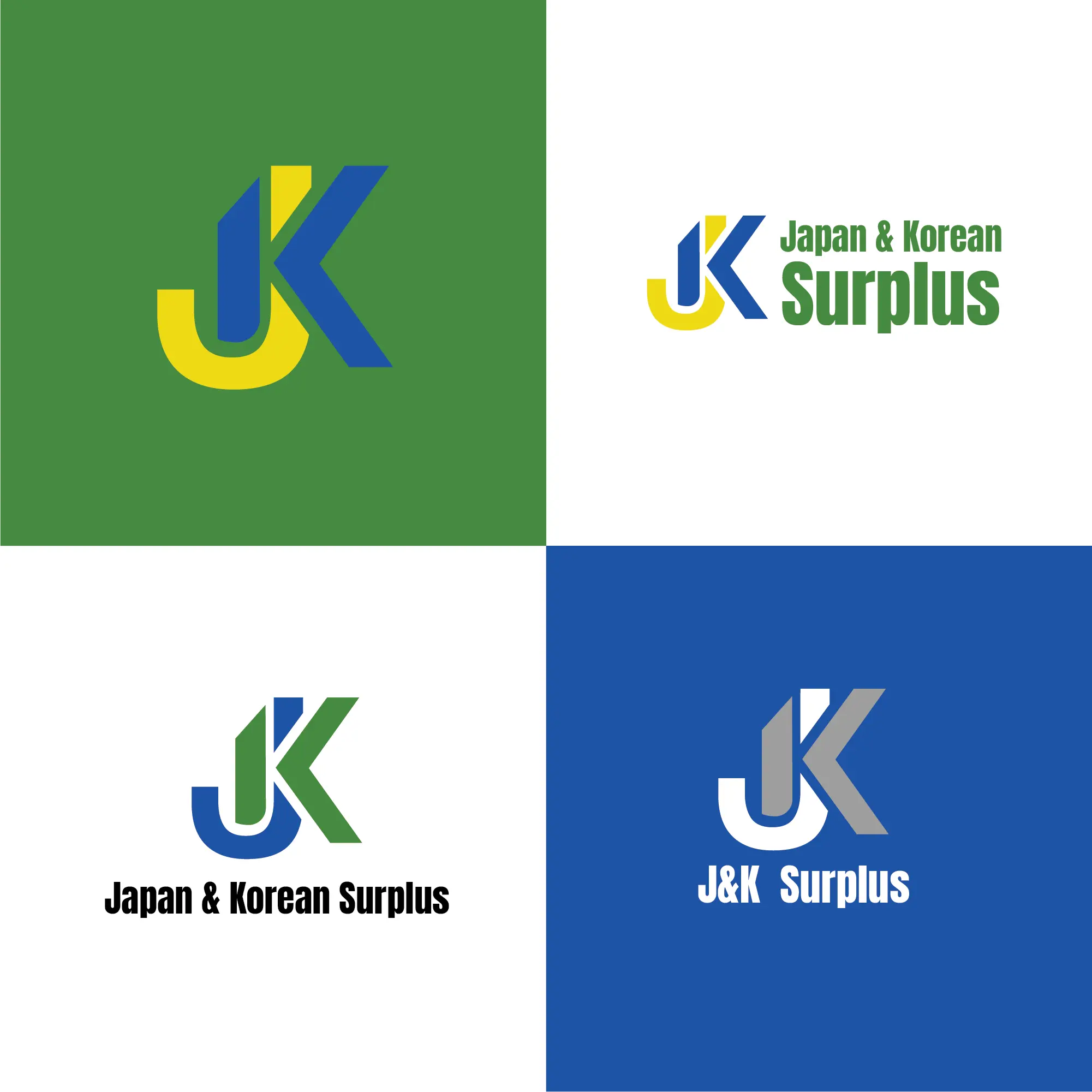
The J&K Surplus logo is designed to express reliability, efficiency, and global connectivity. The bold lettermark creates a strong and recognizable visual identity, while the clean typography reinforces professionalism and clarity. A balanced color palette of blue, green, and yellow adds depth, symbolizing trust, growth, and energy. The overall design reflects a practical yet modern brand presence that aligns with the company’s focus on international trade, value-driven solutions, and dependable service.